Following on from the first post in this series, we’ll leverage the forensic techniques we started with and apply those to a code crime scene in an effort to understand where we might have some quality concerns. And we’ll even try to aid our analysis a bit with some visualizations. So let’s dive in!

One thing I should get out of the way quickly: calling someone’s code a “crime scene” can sound like an insult! It could be assumed that the insult is one that I’m applying to the repositories I’m using for this series of posts. Nothing could be further from the truth. The point is any code repository can be treated like a crime scene and thus have forensic techniques applied to it.
If you plan on following along with running the tools, then I recommend reading the first post to make sure the tooling is set up the way I suggested. It will make it a lot easier to follow along. But, as in the first post, I will provide output here in case you don’t want to run the tools.
Establish the Crime Scene
We need a code base we can look at. I’ve picked one for a tool called Frotz. This is an emulator for a virtual machine called the Z-Machine used by a company named Infocom in the 1980s to provide text adventures on microcomputers. So let’s get that repo; make sure you do the following in your crime_scenes directory.
git clone https://gitlab.com/DavidGriffith/frotz.git
Then make sure you cd frotz to get into the crime scene.
Determine Scope of the Evidence

As you know from the first post, one of the first steps is inspecting the historical commits. This gets you some idea of the scope of your crime scene. One thing that can be somewhat handy right away is to get a feel for the scope of work based on the commits. You can, for example, get a log as such:
git log --pretty=format:'%s'
The command extracts all of the commit messages. You can use one of the many tools out there to create a word cloud from those commits:

It’s a bit of a mess of clues but the above does serve as a useful heuristic. Clearly the words that stand out tell you where time was spent, at least based on how the developers described what they were doing. Ideally what you want to see a lot of are words focused on the domain that the code in question is working within. What we don’t want to see are words that indicate quality problems. So the fact that “Fix” stands out kind of prominently in that cloud isn’t a great thing. Consider that this is a code repository that provides a virtual machine to run text adventure games through a virtual machine, you might see how little of that — at least at a glance — comes through.
With that little bit of evidence gathered, you generally want to limit all of the possible clues to only those modules that have been changed, which is what numstat does for you.
git log --numstat
Clearly you need to get all those clues in a form that’s useful for parsing by the investigation tools. While doing that, you can also focus your search on moments in time. After all, crimes happen and then only later does someone come in to investigate. So any such investigation is, by definition, looking at a past time. The same applies to looking at our code through the magnifying lens of our version control system.

So let’s limit our analysis:
git log --all --numstat --date=short --pretty=format:'--%h--%ad--%aN' --before=2020-08-23
Here I’m looking for all clues before 23 August 2020. There’s a reason I did that for this code base and it has to do with when some fairly hefty changes occurred to use Open Watcom rather than MS-DOS for a portion of the emulator. Don’t sweat the details. I’m just letting you know there is a reason why I chose that date. What this is meant to illustrate to you is that you might choose dates for your own code based on a number of factors; perhaps you want to go to a timeframe before a major refactor happened, as just one example.
Because Frotz is under active development at the time I write this post, certainly things will change if you look at the most recent data since what the “most recent data” is will keep changing. This is sort of like contamination of the crime scene, I guess. To mitigate that, we can roll back the code.
git checkout git rev-list -n 1 --before="2020-08-23" master
I should note that if you do this with a code repository that is using main rather than master, make sure you change the above command accordingly. Also, a reminder to Windows users: you will want to be doing commands like the above in Git Bash or some other POSIX-like environment.
With the above checkout, the Frotz code repo looks as it did back in mid-2020 and we can base our analysis on that.
Generate the Evolutionary Change Log
As in the first post, let’s generate a log file that we can use. In this case, let’s say we want to take a constrained look. We want everything from the beginning of 2020 up to our date, essentially giving us eight months of data.
git log --all --numstat --date=short --pretty=format:'--%h--%ad--%aN' --before=2020-08-23 --after=2019-12-28 > evo.log
The key point here is you are generating the evolutionary change log, just as we did in the first post. That’s the important bit. Whether to parameterize that log with dates, as I’m showing here, is clearly going to be situational. Choosing relevant spans of time generally means you have some idea of the development history of the code base you’re looking at.
Another thing to make sure you keep in mind here is that if you iteratively perform the experiments I’m showing in these posts, you can watch how your development work evolves in your code base and actually watch the evolution of your hotspots. These hotspots — which we’ll uncover in this post — can help you spot trends in how your code base is evolving and how that evolution may be impacting quality.
Analyze the Evidence

Now that we have the spatial or geographical extent, for lack of a better term, of the evidence relevant to our crime scene — our evo.log — we can start doing some analysis. Let’s get a summary overview of the clues that have been generated.
java -jar ../maat.jar -l evo.log -c git2 -a summary
You should see output like this:
statistic,                   value
number-of-commits,           246
number-of-entities,          166
number-of-entities-changed,  558
number-of-authors,           12
So during the specified development period (everything before 23 August 2020 and after 28 December 2019), of the 166 different modules (or entities) in the system, they have changed over five hundred times, with that work being spread over twelve developers, who were the authors of the changes.
Now that you have the modification data, which is a great bit of evidence, the next step is to analyze the distribution of those changes across the modules.
java -jar ../maat.jar -l evo.log -c git2 -a revisions
Here’s some partial output:
entity,               n-revs
Makefile,             68
src/dumb/dinput.c,    22
src/dumb/dinit.c,     20
src/x11/x_init.c,     18
src/common/fastmem.c, 17
src/dumb/doutput.c,   15
src/curses/ux_init.c, 14
....
src/sdl/sf_util.c,    10
src/common/frotz.h,   10
src/x11/x_text.c,     9
src/dumb/dfrotz.h,    8
That means our most frequently modified candidate is Makefile with 68 changes. Any one who has worked on a C or C++ project with a complex Makefile already knows what that indicates! The point here is that we’ve identified the parts of the code with the most developer activity. Given this particular code base and assuming some knowledge of what it does, the indications of “curses”, “x11” and “sdl” would tell you that much of the work has had to do with the display interface logic.
Just as we calculated modification frequencies to determine hotspots, let’s now calculate author frequencies of our modules. We can run this:
java -jar ../maat.jar -l evo.log -c git2 -a authors
entity,               n-authors,  n-revs
Makefile,             7,          68
src/dumb/dinput.c,    3,          22
src/x11/x_init.c,     3,          18
src/curses/ux_init.c, 3,          14
src/sdl/sf_util.c,    3,          10
src/x11/x_frotz.h,    3,          7
src/dos/bcinit.c,     3,          5
src/dumb/dinit.c,     2,          20
src/dumb/doutput.c,   2,          15
This shows the modules, in this case sorted by number of developers. This is the number of programmers who have committed changes to the module. As you see, the Makefile is shared between seven different authors. We can also get a look at the contributions of those developers.
java -jar ../maat.jar -l evo.log -c git2 -a entity-ownership
With that, you can now get information about specific modules and the developers who worked on it. Considering just Makefile:
entity,    author,            added, deleted
Makefile,  David Griffith,    561,   336
Makefile,  Dan Church,        10,    10
Makefile,  Dan Fabulich,      6,     6
Makefile,  Brian Johnson,     32,    3
Makefile,  Bill Lash,         22,    17
Makefile,  Matt Keller,       119,   105
Makefile,  FeRD (Frank Dana), 18,    15
We can isolate a little bit more by looking at a summary of individual contributions by the developers.
java -jar ../maat.jar -l evo.log -c git2 -a entity-effort
entity,    author,             author-revs,  total-revs
Makefile,  David Griffith,     47,           68
Makefile,  Dan Church,         1,            68
Makefile,  Dan Fabulich,       2,            68
Makefile,  Brian Johnson,      3,            68
Makefile,  Bill Lash,          2,            68
Makefile,  Matt Keller,        12,           68
Makefile,  FeRD (Frank Dana),  1,            68
The “total-revs” are 68, which is consistent with our previous data. So what we’re seeing here is a summary of the number of commits for each of the developers.
So this is great! We’ve already figured out some patterns in the changes.
Spatial and Temporal Analysis
We’ve collected some evidence from our crime scene that let’s us trace the spatial movements of the developers who have been making changes to the code. We even have a bit of a temporal component in that we are looking at this over a distinct range of commits over a specified region of time.
One thing I hasten to add is that while we are doing some spatial and temporal analysis here, we aren’t yet getting into spatial and temporal coupling to any great degree. These are topics I will come to in time as they are great clues for possible crimes.
Add Some Complexity
At this point, we’ll use a tool mentioned in the first post, cloc. The GitHub page for the tool gives plenty of ways to install it. If you read the description of the tool, you’ll see that this is basically a language-agnostic lines-of-code counter.
What’s the point of this? Well, we need to balance the above analysis with some idea of complexity. In other words, for the effort put in and the amount of changes made, we want to correlate that with areas of the code that are complex. So we choose a complexity measure.
Okay, but wait … isn’t “lines of code” a terrible measure to use? Well, it depends.
Just like the analysis we’ve been doing in these posts, the metrics we’re gathering are meant to build up a picture. And, like it or not, lines of code is one way to build a fairly decent picture at a broad level. To wit, where there are more lines of code, there is likely more complexity and thus more possible cognitive friction. It’s one of the key early indicators that perhaps we have an area with “too much” code, which can reflect in poorly thought out code boundaries and responsibilities.
It’s not a guarantee. Remember what I said in the first post: we’re not often looking at absolute truths, we’re looking at heuristics.
Let’s get a feel for what this initial complexity analysis gives us:
cloc . --by-file --csv --quiet
Here’s some partial output:
language,      filename,                blank,  comment,  code
C/C++ Header,  ./src/dos/fontdata.h,    0,      0,        2250
C,             ./src/sdl/sf_video.c,    167,    182,      1035
C,             ./src/sdl/sf_osfdlg.c,   147,    42,       1028
C,             ./src/common/screen.c,   348,    487,      963
C,             ./src/sdl/sf_util.c,     172,    130,      843
C,             ./src/sdl/sf_resource.c, 157,    210,      740
C,             ./src/curses/ux_init.c,  176,    303,      734
C,             ./src/sdl/sf_fonts.c,    105,    167,      732
C,             ./src/common/fastmem.c,  168,    223,      727
C,             ./src/curses/ux_input.c, 109,    320,      723
C,             ./src/dumb/doutput.c,    148,    89,       701
.....
SUM,                                  , 6105,   7899,     30343
You can see that the tool attempts to determine the language a given file is written in and then, at the end, provides a summation of all statistical data. The main stat of interest is the last column, which is the count of the actual code. This code base, at this particular point in time, thus has 30,343 lines of active code.
So what we have here is a dimension of complexity, albeit a simplistic one, that we can associate with our above analysis. We’re building up chains of evidence.

Thus what we now have is two different views of the code base: one that tells us where at least some type of complexity is and one that shows individual frequencies of change. What would be interesting to determine is what we find if we look at where those two evidence lines intersect. To find the intersection, we need to merge the data from each of our investigation tools.
To do this, first let’s persist our data output by creating files that capture each of the evidential data streams. We can just pipe the output to our files:
java -jar ../maat.jar -l evo.log -c git2 -a revisions > evidence_change.csv
cloc . --by-file --csv --quiet --report-file=evidence_lines.csv
Now that we have our data, let’s see what we can do to combine it.
Combine the Data to Get Evidence
In the first post, I had you create a scripts directory but we put nothing in there. Now we will. Download the Python script merge_evidence.py and put it in that “scripts” directory.
I should note that the author of the book Your Code as a Crime Scene has made similar Python scripts available as part of the book’s general resources. However, those scripts are a bit poorly written and don’t work at all with Python 3. There are some updated scripts in Adam’s python3 branch. The scripts I’ll be providing have been extensively rewritten and made workable under modern versions of Python, including to pass linting and typechecking tests. That being said, all credit must go to Adam for the original concepts.
Once you have the script in place, do the following:
python ../scripts/merge_evidence.py evidence_change.csv evidence_lines.csv
We just merged our evidence!

We’ve taken multiple clues from our crime scene and looked at them together to build up a picture. You’ll see some output like this:
module,                  revisions,  code
Makefile,                68,         474
src/dumb/dinput.c,       22,         448
src/dumb/dinit.c,        20,         308
src/x11/x_init.c,        18,         474
src/common/fastmem.c,    17,         727
src/dumb/doutput.c,      15,         701
src/curses/ux_init.c,    14,         734
src/sdl/sf_util.c,       10,         843
What that’s showing you is the code base sorted based on the frequency of change (revisions) and the size of the code in question that was changed. Not surprisingly, based on what we saw earlier, the Makefile changed the most often.
What that means is the Makefile is a hotspot. And, once again, anyone who has worked on a C or C++ project with a complicated Makefile would have no trouble understanding why this is the case. Specifically, in the case of Frotz, the Makefile is designed to be portable across various operating systems (without the use of CMake!), which leads to a lot of complexity. Even more interesting, the Frotz project uses a Makefile that calls other Makefiles.
Remember: Hotspots Evolve
Now, I bet you can intuit a specific issue. In the first post, we saw that with the Site Prism project, the most complicated file that had the most work done by the most developers was also one that hadn’t been updated in many months. What this means is what we already know: our focus and emphasis in a code base shifts. What that means is that any given hotspot may stop being one. And an area that wasn’t a hotspot before may become one.
As another example, in the above list our second contender for hotspot, the dinput.c module, may have had some redesign done to it. So originally it was a hotspot but then it was redesigned and it stopped being so. That would be a case of the hotspot cooling down. But you’ll only see that hotspot cool down over a given duration of time. All of this is why I referred to “spatial and temporal analysis” earlier.
One key thing to keep in mind is that hotspots generally allow for good predictions of bugs or areas of compromised design. If I were a tester, I would want to know these areas so I could better understand what changes were made which might further guide my testing.
Having worked a bit on the Frotz project, I can say that the Makefile bit was tricky to get right in terms of having it work seamlessly on Linux, Mac and Windows. The files in the “dumb” directory you see in the above output were also tricky because that logic refers to a “dumb terminal” that has to know how to handle what it can’t display from what is usually a richer set of choices.
So our hotspots show us — at least at the time under consideration — where bugs are likely gathering. Much like in the actual insect world, if you find one, there are probably many others lurking in that immediate area. Further, as industry research has amply demonstrated, what you’re likely to find is that the most bugs will be congregating in relatively few modules.
Generate Visualizations of Evidence
This next part can be a little bit of a slog because we have to set up tooling. I will show the output of the tooling so if you prefer to just skim and see the outcomes, that’s entirely fine. But I also do give you the means to recreate those outcomes, which I think is really important for these kinds of posts. What we’re doing here are experiments and experiments are only good if someone else can replicate them.
Tree Maps
Tree maps are a way visualize any hierarchically structured data. “Hierarchically structured” basically means tree-structured. Tree-structured data makes up a tree diagram and a tree map is a way to view that diagram as a set of nested rectangles.
There’s a tool called Processing. You have to download Processing for your operating system. For MacOS, you’ll just install this as an application. For Windows, you can extract that archive into a directory and you can run the provided processing.exe executable from there. With this tool, you can use what it calls “sketchbooks” that generate views from your data. One of those is a tree map.
You’ll need a treemap library to do this. Just unzip the file, and place the treemap folder into your Processing libraries folder. Where this folder is will depend on your operating system. On Windows this will be \Documents\Processing\libraries. For POSIX operating systems, you should find this in ~/Documents/Processing/libraries.
You’ll also want to grab some pre-defined treemap metrics sketchbooks. Note that this is very similar to what Adam provides in his MetricsTreeMap repository. Unzip this in your crime_scenes directory. It will create a treemap_metrics directory.
In order to use this, you just have to create a data file, composed of two columns, and provide that file in the directory. So do this:
java -jar ../maat.jar -l evo.log -c git2 -a revisions > metric_data.csv
That file — and it must be named metric_data.csv — is what the metric tree map sketchbooks will expect. So just copy that file into the “treemap_metrics” directory and open the treemap_metrics.pde file. You’ll see something like this:
This is a very simple visualization of what the our clues above were telling us.
Enclosure Diagrams
A lot of the hotspot diagrams you see out there — whether it be network connectivity or disease tracking — are based on what are called enclosure diagrams. Being admittedly simplistic, an enclosure diagram is a visualization of hierarchical data structures, similar to the tree map. The difference here is that the diagram is usually generated by what’s called a recursive circle packing algorithm.

The diagram uses a form of containment nesting to represent the hierarchy of the data. The data is treated as a tree and each tree of that data has nodes, the end points of which are called leaf nodes. Circles are created for each leaf node and the size of a given circle is proportional to a particular quantitative dimension for the data element in question.
A very popular tool for providing these visualizations is D3.js, which is a JavaScript library for visualizing data. This library provides a circle packing algorithm for you but it does require a JSON document to parse. So we have to turn our data into that format. To do that, here again I’ll provide a script, generate_evidence_json.py. Put that in the scripts directory and run the following:
python ../scripts/generate_evidence_json.py --structure evidence_lines.csv --weights evidence_change.csv > data.json
This gives the data in a format that can now be fed into D3.js.
Download my visualize.zip archive. Unarchive that in your crime_scenes directory. That will create a visualize directory at the same level as your scripts directory. Now copy your above generated data.json into that “visualize” directory.
In the “visualize” directory, there’s a view.html that provides the setup to hook into D3.js. It’s already set up to load the JSON file for your generated data, which is what’s providing the basis for the hotspot analysis. To view this, however, you need to execute the JavaScript on a web server. Since you’re already using Python, one easy way to do that is to go into the “visualize” directory and do this:
python -m http.server
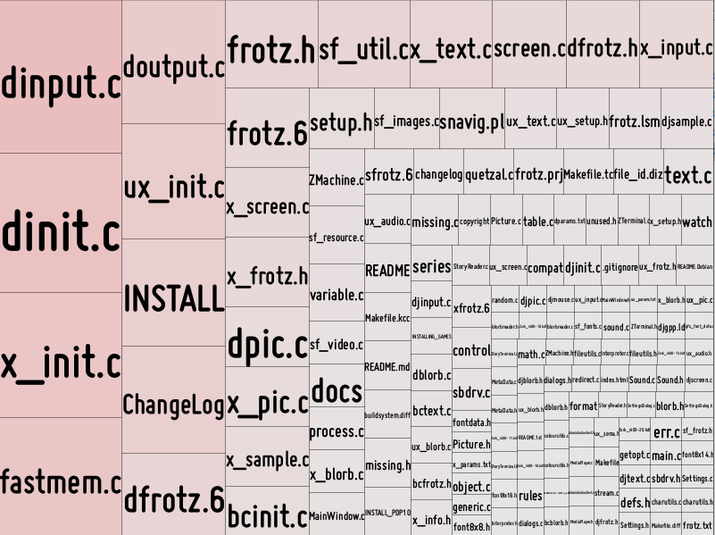
You can then view everything from the URL http://localhost:8000/view.html. At a high level, you’ll see this:

That’s showing you the main area of code, which is in the “src” directory of the Frotz repo. You can also zoom in a bit:
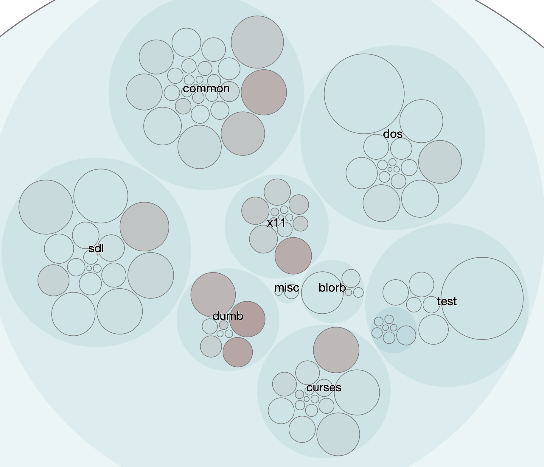
In our case, the more complex a module, based on our complexity measure of lines of code, the larger the circle. The more effort that’s been spent on a module, measured by the number of changes, makes the circle a darker color. Let’s zoom in a little closer:
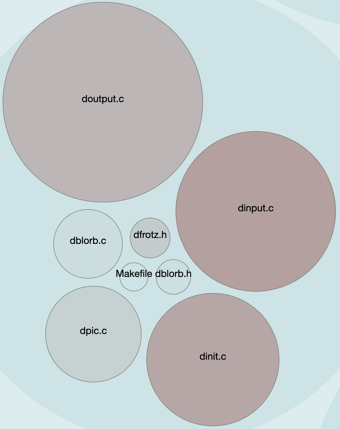
The “dumb terminal” files, as we saw earlier, were definitely an area where a lot of work was done. And here we see those hotspots front-and-center. Our evidence earlier had shown us this:
module,                  revisions,  code
src/dumb/dinput.c,       22,         448
src/dumb/dinit.c,        20,         308
src/dumb/doutput.c,      15,         701
Reasoning About the Visual Evidence
So what we have is here is a case where the visualization is not really telling us anything new but it’s providing a different way to look at it. In a lot of crime scene analysis, often that’s key: looking at the same evidence but with a different viewpoint in mind. Our work on the visualizations also has the added benefit of confirming that our evidence lines are converging, which is always nice. It means we can trust the data we’re getting at each stage of our analysis because it’s consistent.
If you consider the more zoomed out view above, we can also see that changes to one hotspot might be impacting others. It looks like x11, dumb, sdl, and curses change together. At least they seem to have in the time frame we’re considering.
We might also notice that the “tests” area looks remarkably stable.
But does that mean we’re perhaps not updating our tests as much as we are the code?
Further, why does SDL — which is definitely more heavy in terms of graphic display logic — seem to be less of an overall hotspot than the “dumb” terminal, which displays no graphics at all? And is the “dos” section showing less hotspot activity because it’s truly that stable? Or is it just that we have no idea how to do the DOS stuff so we barely touch it?
We’re also seeing something I mentioned in the first post: different features will tend to stabilize at different rates. Here it’s quite possible that DOS has stabilized as has SDL as has curses. But x11 and dumb continue to be hotspot areas.
Evidence Trail Led Us Where?
Our sleuthing has led us to some conclusions.
- We clearly see we have some areas that are more stable than others.
- We clearly have some areas of the code base that are hotspots.
- We clearly see that our code base is evolving at different rates among the different areas.
We can also see that we have what appear to be some clearly well-defined boundaries. Yet we also see that perhaps we have too little cohesion which suggests boundary issues.
From our analysis, we also see what particular areas of the code have been worked on a lot (number of changes) as well as how much effort has gone into them (number of developers related to number of changes). We also have a very rough complexity measure. This can help us start looking at whether any of our modules, say, dinput.c in the “dumb” cluster should have a design review. Consider the size of our doutput.c and dinput.c modules:

Maybe these are changing so much because they have too many responsibilities. Perhaps the size, and intensity, of the hotspots are showing that this is code that would benefit from some refactoring; perhaps by more granular boundaries based on further defined and smaller responsibilities. Hotspots frequently arise from code that accumulates responsibilities. Code that accumulates responsibilities tends to grow larger. Which means it has more reasons to change and thus more work done to it.
Essentially we have an idea on where quality problems are most likely to surface and we have an idea on what modules within the larger system are at least potentially problematic, particularly from a design perspective. If I’m working in the context of a test specialist, what I’ve just done is help the developers test their code base as a whole. That’s a pretty important value addition.
Next Steps!
In the next post, we’re going to continue with Frotz a little bit — so keep all this work handy! — but then we’re also going to jump into a much larger repository and apply some of the same techniques we’ve been doing in these first two posts while expanding our knowledge a bit.
