In this post, we’re going to look at the Emotions dataset that we briefly investigated in the previous post. Here we’re going to consider the basis of that dataset. Then we’ll load it up and see if what we have to do in order to feed the data to a training model.

Getting Set Up
If you choose to follow along with my Python examples, you’re going to need a lot of libraries. In a few specific cases, I’ve found it can make a difference in terms of the order that they are installed. So to avoid running into that as well as to avoid constantly interrupting to tell you to install yet another library, I recommend getting the following in the proposed order:
pip install llvmlite
pip install numba
pip install umap-learn
pip install pandas
pip install matplotlib
pip install datasets
pip install transformers
pip install torch
Doing this will also automatically get you the numpy and scikit-learn libraries. In fact, it’s those libraries, combined with numba that often give various conflicts, particularly when llvmlite is required.
Obviously you should do this in whatever virtual environment you’re using. I happen to use Poetry to drive all my work projects in Python. The Python version matters slightly less. I tried all this with Python 3.9.x and Python 3.10.x.
The Basis of Emotions
One thing that’s really good to do is consider the basis of the work that you’re dealing with. Sometimes you’ll be working in a context that’s blazing new trails but other times you’ll be working along a well-trodden path. Whatever context exists as the basis for your work, you should be aware of it.
The basis of this work on the Emotions dataset is the paper “CARER: Contextualized Affect Representations for Emotion Recognition”. I also provide a PDF copy.
Again, we’re going to use my Emotions dataset as the basis for testing what’s described in the paper. You should get used to looking at papers like this and being able to distill some of the key conceptual points. For me, those were the following:
- “constructing contextualized affect representations from text.”
- “capture the evolving linguistic variability found in large-scale opinionated content.”
Regarding the first point, “contextualized” means developing an approach that can detect and represent emotions expressed in text, taking into account the broader context in which those emotions appear. The term “constructing” implies that the work is not just about identifying emotions in the text but actually building or creating some sort of structured representation of those emotions.
Regarding the second point, remember in the last post when we talked about what makes up a “good enough” dataset? Well, in this context, when I read “linguistic variability,” that certainly tells me that I have to at least consider enough data where there is a chance for sufficient variability. Even the notion of “evolving” tells me another dimension along which I may need to consider this particular quality.
Notice that these terms, like that of “large-scale,” are terms that testers are conditioned to watch out for. They are vague qualifiers. This would be akin to us accepting requirements where someone said “It has to be easy and fast.” Testers like to unpack suitcase words.
Investigating the Basis
The authors of the paper in question say:
As an overview, we first collect an emotion dataset through noisy labels, annotated via distant supervision.
That idea of “distant supervision” references the paper “Twitter sentiment classification using distant supervision”. So right there you’re probably going to want to stop with this paper and go read that one. And you want to read that one carefully. A case in point is that one thing this second paper makes clear:
The main contribution of this paper is the idea of using tweets with emoticons for distant supervised learning.With emoticons. Got it. Yet later in the paper it says:
We strip the emoticons out from our training data.
Uh, okay. Is this a contradiction?
As it turns out, no. The paper uses emoticons as distant supervision to label the data but removes the emoticons before training the sentiment analysis classifiers. That’s somewhat crucial to understand as is the rationale for this.
That rationale is because the observed impact on accuracy when leaving the emoticons in the training data suggested to the researchers, based on their testing, that different classifiers react differently to the presence of emoticons.
Here “classifiers” refer to algorithms or models that are used to categorize or label data into different classes or categories.
So what is this “distant supervision” that keeps being mentioned?
Distant supervision is a semi-supervised learning approach that leverages existing, often noisy, labeled data to train a machine learning model.

In the above visual, the notion of external data is used to provide annotated data. That annotated data then becomes training data for a learning model. In the context of sentiment analysis, distant supervision is used to automatically generate labeled data by associating sentiment labels with certain instances of text based on external information, such as sentiment indicators or cues.
The term “distant supervision” is used in the context of machine learning to emphasize the fact that the supervision — by which is meant the labeling of data — comes from a distant or indirect source, rather than directly annotated by humans as in traditional supervised learning.
In traditional supervised learning, data is manually labeled by humans. This can obviously be a time-consuming, not to mention expensive, process. However, this labeled data is typically accurate and reliable. In contrast, distant supervision leverages existing data with indirect or weak signals to automatically generate labels.
A “weak signal” in the context of distant supervision refers to an indirect or uncertain indicator that’s used to infer or approximate the labels for training data.
So in distant supervision, you might, as the above paper describes, decide to use the presence of emoticons as a weak signal to determine sentiment. You might assume that reviews containing emoticons like 😀 (“grinning face”) or 😍 (“smiling face with heart-shaped eyes”) are likely to be positive, while those containing emoticons like 😠 (“angry face”) or 😢 (“crying face”) are likely to be negative.
The distant signals, like those emoticons, are not necessarily perfect indicators of the true labels. For example, someone could be using an emoticon ironically. Thus this approach introduces noise into the labeled dataset.
Putting this in context, and going back to our original paper, the authors say the following:
We use the eight basic emotions: anger, anticipation, disgust, fear, joy, sadness, surprise, and trust. The hashtags (339 total) serve as noisy labels, which allow annotation via distant supervision.
So here the hashtags were one aspect of the noisy labels.
It’s worth thinking about why hashtags might be noisy. Sometimes hashtags are used to discuss trending topics or events that might not have any inherent sentiment. People might use hashtags in unconventional or personal ways that don’t align with the standard sentiment associated with them. And some hashtags are just overly general and might not directly indicate sentiment at all.
It’s worth noting that there are eight emotions described in the paper whereas my example dataset is only using six. This preprocessed six emotion variant is something that has been released for educational and research purposes. It’s also worth noting that my emotions dataset is smaller than the original dataset used by the authors.
The authors also state:
To ensure data quality, we follow the pre-processing steps proposed by (Abdul-Mageed and Ungar, 2017), and considered the hashtag appearing in the last position of a tweet as the ground truth.
Here the paper they refer to is “Emonet: Fine-grained emotion detection with gated recurrent neural networks”. I also have a PDF copy.
I recommend reading section 3.2 (“Preprocessing and Quality Assurance”) of that paper. Some of the core elements to understand are the following about the processing that was done on the dataset:
- Emoticons are stripped off:
:) : ) :-) :D =) :( : ( :-(
- Tweets with “:P” are removed.
- Tweets containing both positive and negative emoticons are removed.
- Retweets are removed.
- Repeated tweets are removed.
There are some other pre-processing steps done but I’ll let you consume the material in the papers to see what those are.
Finally, the authors of our original reference paper say the following:
We split the data into training (90%) and testing (10%) datasets.
The authors then provide a distribution of their data based on the hashtag noisy signal.

Thus the authors provide a distribution of the data hashtag examples related to a particular emotion. But as you know from the previous post in this series, the dataset I’m providing is broken down like this:
- Training data = (16,000 / 20,000) × 100 ≅ 80%
- Testing data = (2,000 / 20,000) × 100 ≅ 10%
- Validation data = (2,000 / 20,000) × 100 ≅ 10%
So, along with the number of emotion labels, and the amount of data, I also differ in the distribution of that data.
The Focus on Research
There’s actually two points to emphasize here.
One thing I want to emphasize is that sometimes what you read in the various research or academic papers and what you have available as datasets based on those papers can differ. While academics should release all of their data for experimentation, a sad reality is that they often don’t.
That being said, there are often variants of the more complete datasets made available so that experimentation can take place. That’s the case with the dataset I’m providing here.
Another thing I want to emphasize with the above is learning how to read these research papers is a really important skill.
As anyone who has done any concerted research or scholarship knows, you often run into a quickly cascading series of primary references and then secondary references. My personal approach is to concentrate on primary references, leveraging secondary only when the primary lacks relevant context.
Many papers include code, data, and experimental setups. Reproducing their results not only helps validate their findings but also teaches you practical implementation and experimentation.
That’s a good thing. The negative side of this is that some papers focus more on theoretical aspects and lack practical examples or explanations. Thus non-experts might struggle to relate the concepts to real-world scenarios.
Papers also introduce foundational concepts, theories, and terminology. They provide a deeper understanding of the principles underlying different models, algorithms, and methodologies.
Again, that’s a good thing. The negative side of this is that the use specialized terminology and technical jargon, often unexplained, might be unfamiliar to non-experts. This can make it difficult to understand the content and concepts being discussed.
This is a tricky balance as my own posts in this series has shown. I try to provide sufficient context and explanations for certain concepts. I do this so non-experts — like me! — struggle less to connect the dots between different ideas and components.
Let’s Get Emotional
So let’s load up our Emotions dataset. We’re going to do this just like we loaded up the Rotten Tomatoes one in the last post. Start up a Python script and put the following in place.
|
1 2 3 |
from datasets import load_dataset dataset = load_dataset("jeffnyman/emotions") |
When you run this script, you’ll see a bunch of statements about what’s being downloaded and generated.
Downloading data
Downloading data files
Extracting data files
Generating train split
Generating validation split
Generating test split
Let’s look at our dataset broadly:
|
1 |
print(dataset) |
You’ll see this:
DatasetDict({
  train: Dataset({
      features: ['text', 'label'],
      num_rows: 16000
  })
  validation: Dataset({
      features: ['text', 'label'],
      num_rows: 2000
  })
  test: Dataset({
      features: ['text', 'label'],
      num_rows: 2000
  })
})
We can break out our data based on each individual dataset shown in that output.
|
1 2 3 |
data_train = dataset["train"] data_test = dataset["test"] data_validate = dataset["validation"] |
Now let’s look at the features in our training data:
|
1 |
print(data_train.features) |
You’ll get the following:
{'text': Value(dtype='string', id=None), 'label': ClassLabel(names=['sadness', 'joy', 'love', 'anger', 'fear', 'surprise'], id=None)}
Here notice our class labels. Those refer to the specific sentiment labels that are in the dastaset.
Finally, let’s get a feel for the data itself:
|
1 |
print(data_train[0]) |
That gives you the following:
{'text': 'i didnt feel humiliated', 'label': 0}
That’s showing you the first preprocessed bit of text in the training dataset. This is all pretty similar to what we did in the last post.
Visualizing Our Data
I’ve used Pandas for some visualization aspects around tabular data. Let’s do that again here. We can convert our Dataset object into a Pandas DataFrame.
In order to keep our script clean for these next parts and easy to talk about, let’s do a reset of the script so that it looks like this:
|
1 2 3 4 5 |
from datasets import load_dataset dataset = load_dataset("jeffnyman/emotions") dataset.set_format(type="pandas") |
What that last statement does is change the output format of the Dataset when operations are performed on it.
The format, at the time of writing this, can be ‘numpy’, ‘torch’, ‘tensorflow’, ‘pandas’, ‘arrow’, and ‘jax’.
So let’s capture all of our training data in a DataFrame.
|
1 2 3 |
df = dataset["train"][:] print(df.head()) |
You should get output like this:
                                                text  label
0                            i didnt feel humiliated      0
1  i can go from feeling so hopeless to so damned...      0
2   im grabbing a minute to post i feel greedy wrong      3
3  i am ever feeling nostalgic about the fireplac...      2
4                               i am feeling grouchy      3
We can see that first row matches the data we looked at earlier. Notice here that our labels are being represented as integers. But earlier we saw that there was a set of class labels. You might prefer to see those in the output as well.
There’s a helper method of the label feature you can use that will let you create a new columnn in the DataFrame with the actual label names. The method is called int2str. The name of the method might not seem intuitive but it’s essentially turning the above integers into their string representation.
So here’s what you can do to get this to work and, once again, I’m going to show the full script just so you can orient yourself easily around the changes I’m making.
|
1 2 3 4 5 6 7 8 9 10 11 12 13 14 |
from datasets import load_dataset def label_name(row): return dataset["train"].features["label"].int2str(row) dataset = load_dataset("jeffnyman/emotions") dataset.set_format(type="pandas") df = dataset["train"][:] df["label_name"] = df["label"].apply(label_name) print(df.head()) |
Here I added a function and I’m doing this because this is something you’ll want to get familiar with as your scripts in this context get more complex.
The output of this is:
                                                text  label label_name
0                            i didnt feel humiliated      0    sadness
1  i can go from feeling so hopeless to so damned...      0    sadness
2   im grabbing a minute to post i feel greedy wrong      3      anger
3  i am ever feeling nostalgic about the fireplac...      2       love
4                               i am feeling grouchy      3      anger
So, again, we’re just getting some visualizations of our data so that we make sure we understand it.
Please understand that what we’re doing here is testing. We’re testing the data we have and we’re, in effect, testing our ability to work with and reason about it.
Balancing Our Data
There’s one other thing we can do here that’s important. When dealing with text classification tasks, you want to analyze the distribution of examples among the different classes. You want to look if you have balanced or imbalanced data.

The reason for this is that a dataset with an imbalanced class distribution might require some adjustments in training loss and evaluation metrics compared to a balanced dataset.
Now let’s unpack that last statement a bit.
When I say “training loss,” this is a numerical value that measures how well a machine learning model is performing during training. It represents the discrepancy between the model’s predicted outputs and the actual target labels in the training data. So if the model predicts “sadness” but the actual target is “anger”, we have a discrepancy. The extent of those discrepancies is, effectively, the loss.
In the context of text classification, the training loss is used to optimize the model’s parameters — usually described as “weights” and “biases” — during the training process. The goal is to minimize the training loss so that the model’s predictions align closely with the correct labels.

That visual shows you a training loss that starts very high but gradually gets lower the more the model trains.
In a dataset with an imbalanced class distribution — meaning where one class has significantly more samples than others — the model may perform poorly if it’s biased towards the majority class. In those kinds of situations, you’ll want to make adjustments to address the issue and improve the model’s performance.
How do you do that?
One approach is to modify the training loss function to assign higher importance to the minority class. This helps the model focus more on correctly classifying the minority class examples, reducing the impact of the class imbalance on the training process. So with this approach you don’t really fix the imbalance, you just orient the model differently.
Another adjustment is to use evaluation metrics that are sensitive to class imbalance. For instance, using accuracy alone would probably not be sufficient in imbalanced datasets because it can be misleading. Instead, metrics like precision and recall — as well as an F1-score which combines those — may be more informative for imbalanced problems.
I talked about some of these evaluation metrics in my AI Testing – Measures and Scores posts.
But is this something we have to worry about? Well, that’s a good question. So let’s actually look at the breakdown of samples. Go ahead and add the following to your script.
|
1 2 3 4 5 6 7 8 9 10 |
import pandas as pd # ... existing code ... data_train = dataset["train"] labels_series = pd.Series(data_train["label"]) class_distribution = labels_series.value_counts() print(class_distribution) |
You’ll get this:
label
1    5362
0    4666
3    2159
4    1937
2    1304
5     572
Here, as before, you might want to get the actual labels. Just replace the statement that sets the class_distribution variable with this:
|
1 2 3 |
class_distribution = labels_series.apply( lambda x: data_train.features["label"].int2str(x) ).value_counts() |
You’ll get the following:
label
joy         5362
sadness     4666
anger       2159
fear        1937
love        1304
surprise     572
So our dataset most certainly does not have an equal number of samples in the train split for the various clases. Thus we know we’re dealing with an imbalanced dataset.
As you’ve probably gathered, an imbalanced dataset is one in which the number of instances for different classes varies significantly. In our case, there are significantly more instances labeled as “joy” and “sadness” compared to the other emotions like “anger,” “fear,” “love,” and “surprise.”
Visualize Our Balance
As long as we’re bringing in Pandas for visualization of our data, let’s also bring in the Matplotlib library so we can visualize some aspects of our data by plotting it out.
In this case, let’s plot a horizontal bar chart to visualize the frequency (count) of unique classes present in the “label_name” column of the DataFrame. Once again, here’s the full script since I need to make a lot of little changes and some removals.
|
1 2 3 4 5 6 7 8 9 10 11 12 13 14 15 16 17 18 19 20 |
import matplotlib.pyplot as plt from datasets import load_dataset def label_name(row): return dataset["train"].features["label"].int2str(row) dataset = load_dataset("jeffnyman/emotions") dataset.set_format(type="pandas") df = dataset["train"][:] df["label_name"] = df["label"].apply(label_name) ax = df["label_name"].value_counts(ascending=True).plot.barh() ax.set_ylabel("Emotions") plt.subplots_adjust(left=0.15) plt.title("Frequency of Classes") plt.show() |
With this you’ll get the following:
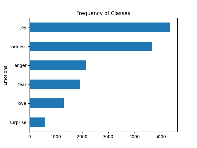
Clearly all that just shows us visually what we already saw in our data.
So we’ve done some good testing here to determine a possible concern for our data. That said, while testing can point out possible risks, it doesn’t mean those risks have to be mitigated.
Case in point: we’re actually not going to worry about this for our purposes here. But it is important to consider strategies to address imbalance since this might be something you work with on a delivery team.
- Resample your data. You can either oversample the minority classes (creating more samples of them) or undersample the majority class (removing some samples of it).
- Synthetically generate your data. Techniques like Synthetic Minority Over-sampling Technique (SMOTE) can help create synthetic instances of the minority classes to balance the dataset. Essentially you build “synthetic” data that matches the real data.
- Apply weighted loss to your data. You can assign higher weights to the loss function for the minority classes during training. What that does is give the minority classes more importance.
- Apply ensemble methods to your data. There are various so-called ensemble techniques like Random Forest and Gradient Boosting. This is an involved topic but these techniques can sometimes help you deal with imbalanced datasets, essentially by giving more attention to the minority classes during model training.
Again, we’re not going to worry about the imbalance in our case. The reason for this is a simple one: we have a realistic representation.
In some cases, the imbalance in a given dataset might reflect the real-world distribution of sentiments. If the distribution of positive, negative, and neutral sentiments in the real world is imbalanced (which it probably will be), then it might be more meaningful to train a model on a similarly imbalanced dataset to better reflect the practical scenario.
Verify Data for Training
Transformer models like DistilBERT impose a maximum input sequence length known as the maximum context size. The ceiling of the context size essentially determines the length of the input text that the model can process in a single input sequence.
This size limit serves as a constraint on the input text length. This is done to help the model’s efficiency and effectiveness.
For DistilBERT, this size is limited to 512 tokens. That’s roughly equivalent to a few paragraphs of text. In this context, as we’ve seen in previous posts, tokens can represent words, subwords, or characters, depending on how the text has been tokenized.
By analyzing the distribution of words per text in our data, we can obtain a rough estimate of text lengths per emotion. One thing we can do is calculate the number of words in each text of a DataFrame and then visualize the distribution of these word counts across different classes using a box plot.
Again, here’s a full example of a script where you can try this out.
|
1 2 3 4 5 6 7 8 9 10 11 12 13 14 15 16 17 18 19 20 21 22 23 |
import matplotlib.pyplot as plt from datasets import load_dataset def label_name(row): return dataset["train"].features["label"].int2str(row) dataset = load_dataset("jeffnyman/emotions") dataset.set_format(type="pandas") df = dataset["train"][:] df["label_name"] = df["label"].apply(label_name) df["Words Per Text"] = df["text"].str.split().apply(len) df.boxplot( "Words Per Text", by="label_name", grid=False, showfliers=False, color="black" ) plt.suptitle("") plt.xlabel("") plt.show() |
Here you’ll get the following:

All text seem to be around sixteen to twenty or so words long. Thus even the longest bits of text are well below DistilBERT’s maximum context size.
What do you do if the length of elements in your data exceed a model’s context size?
Well, in that case truncation becomes necessary. In those kinds of situations, it’s important to recognize that truncation can potentially result in performance degradation if essential information is omitted.
While it’s a bigger topic than I go into here, I will say that there are techniques you can use to mitigate the potential loss of essential information when truncating text to fit within your model’s context size.
- Segment your data. You can divide your longer text into smaller segments or chunks, each of which fits within the model’s context size. Then you can process multiple segments sequentially, potentially preserving more context.
- Use positional context for your data. If the most important information in the text is located towards the beginning or end, you can prioritize truncation to keep that information intact. For instance, you could truncate from the opposite end of where the crucial details are.
- Use attention mechanisms with your data. Some models, like Transformer-based models, use attention mechanisms that allow them to pay more attention to relevant parts of the input sequence. This actually doesn’t completely eliminate the issue but it can help the model focus on important information even if the entire context isn’t available.
- Use extractive summarization on your data. You can use extractive techniques to automatically identify and retain the most important sentences or phrases within the text you’re dealing with. These summaries are then used in place of or in addition to the original text.
All this being said, in our scenario, it appears that this concern of hitting the context size ceiling doesn’t apply.
Once you’re pretty you have the visualizations you want, you can reset the output format of the dataset.
|
1 |
dataset.reset_format() |
You only need to do this, of course, if you’re going to keep the visualization logic in place. Normally you would extract that logic out to various functions or just remove it entirely once you have what you need.
Wasn’t This Messy?
So in this post I kept showing you a script that was changing and you could certainly be forgiven for finding the process of this post a little less smooth than others in this series.
Believe it or not, that was intentional. I was actually working out how to create these scripts based on what logic I think I needed as I thought I needed it while writing the post. Thus: I was experimenting. And this is exactly what you might find yourself doing as you learn on your team.
Now a temptation would be to potentially throw out all the above and start with our core logic once we feel we understand our data. That’s possible, for sure. It keeps the scripts clean. But you can also keep the logic and create functions out of it. So here I am right now offering you the final script I just constructed based on going over some of what I talked about here.
First I did this:
|
1 2 3 4 5 6 7 8 9 10 11 12 13 14 15 16 17 18 19 20 21 22 23 24 25 26 27 28 29 30 31 32 33 34 35 36 37 38 |
import pandas as pd import matplotlib.pyplot as plt from datasets import load_dataset def label_name(row): return dataset["train"].features["label"].int2str(row) dataset = load_dataset("jeffnyman/emotions") dataset.set_format(type="pandas") df = dataset["train"][:] df["label_name"] = df["label"].apply(label_name) # Get class distribution labels_series = pd.Series(df["label"]) class_distribution = df["label"].apply(label_name).value_counts() print(class_distribution) # Get frequency chart ax = df["label_name"].value_counts(ascending=True).plot.barh() ax.set_ylabel("Emotions") plt.subplots_adjust(left=0.15) plt.title("Frequency of Classes") plt.show() # Get box plot df["label_name"] = df["label"].apply(label_name) df["Words Per Text"] = df["text"].str.split().apply(len) df.boxplot( "Words Per Text", by="label_name", grid=False, showfliers=False, color="black" ) plt.suptitle("") plt.xlabel("") plt.show() |
That helped me see the breakdown I wanted but I wanted this to be even more scalable and maintainable. And so I took the above and ended up with this:
|
1 2 3 4 5 6 7 8 9 10 11 12 13 14 15 16 17 18 19 20 21 22 23 24 25 26 27 28 29 30 31 32 33 34 35 36 37 38 39 40 41 42 43 44 45 46 47 |
import matplotlib.pyplot as plt from datasets import load_dataset def label_name(row, dataset): return dataset["train"].features["label"].int2str(row) <p>def load_and_preprocess_dataset(): <p> dataset = load_dataset("jeffnyman/emotions") <p> dataset.set_format(type="pandas") <p> df = dataset["train"][:] <p> df["label_name"] = df["label"].apply(lambda x: label_name(x, dataset)) <p> return df def plot_class_distribution(df): class_distribution = df["label_name"].value_counts() print(class_distribution) ax = class_distribution.plot.barh() ax.set_ylabel("Emotions") plt.subplots_adjust(left=0.15) plt.title("Frequency of Classes") plt.show() def plot_box_plot(df): df["Words Per Text"] = df["text"].str.split().apply(len) df.boxplot( "Words Per Text", by="label_name", grid=False, showfliers=False, color="black" ) plt.suptitle("") plt.xlabel("") plt.show() def main(): df = load_and_preprocess_dataset() plot_class_distribution(df) plot_box_plot(df) if __name__ == "__main__": main() |
You often want to encode your explorations in these contexts in a structured way once you have understanding. But I’ve found that trying to do that before you have understanding often has you worrying more about the code than about what the code is helping you learn.
Note here that what we did while constructing these scripts was a form of exploratory testing. What we ended up with is a script that could be used in scripted testing if we wanted to replicate our experiments.
My advice: be comfortable with being messy initially and then refactor/refine once you feel you have something solid. Incidentally, I feel this applies to any time you explore (which we did in this post) and then turn the exploration into a script (which we also did in this post). And that script is very much a type of test applied to our data.
What’s Next?
We now want convert all of those raw text examples from our dataset into a format suitable for our Transformer model. If this sounds a whole lot like what we did in the previous posts, you would be correct! We’ll do that in the next post.
